Worldpay
Branding - Worldpay for Platforms
The Challenge
When Worldpay acquired Payrix, my job was to "embed" this new jewel into the Worldpay crown. We had to make Worldpay for Platforms feel like a natural evolution of the brand, not a corporate takeover. The goal was to keep that startup soul alive while making it clear they were now part of something much bigger.
The Solution
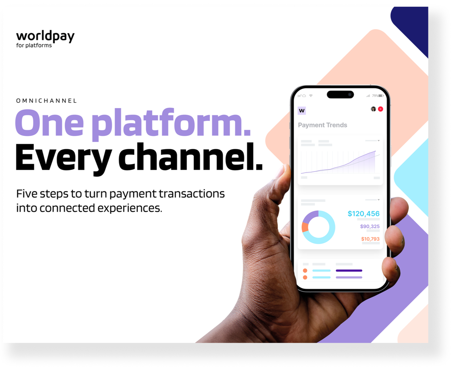
Bridging the two identities by bringing Payrix purple to the fore—it’s a secondary colour for Worldpay, so it felt familiar but fresh. We introduced believable human photography, tech-focused iconography and gradients to signal a "same but different" vibe.
This wasn't just a logo and a landing page. Over 50+ Ebooks and product marketing assets were rolled out, ensuring the new brand felt consistent and premium across every single piece of sales and thought-leadership collateral.
The Result
A brand transition that felt logical, and most importantly, cohesive. The Worldpay for Platforms team now has a comprehensive toolkit to go out and own the embedded payments space.
There was an 18% increase in engagement six months after the launch of the rebranding and new website.
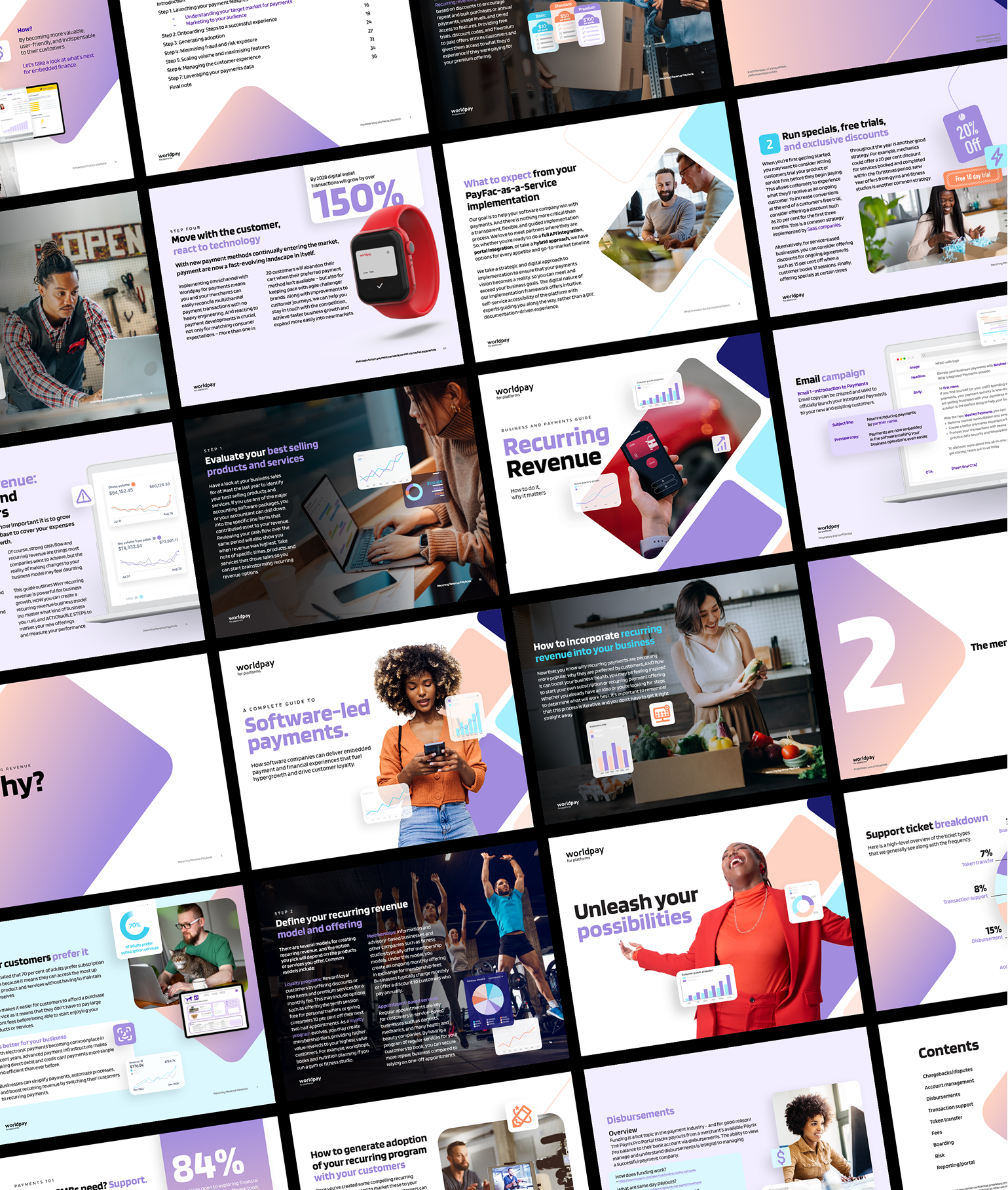
Ebooks
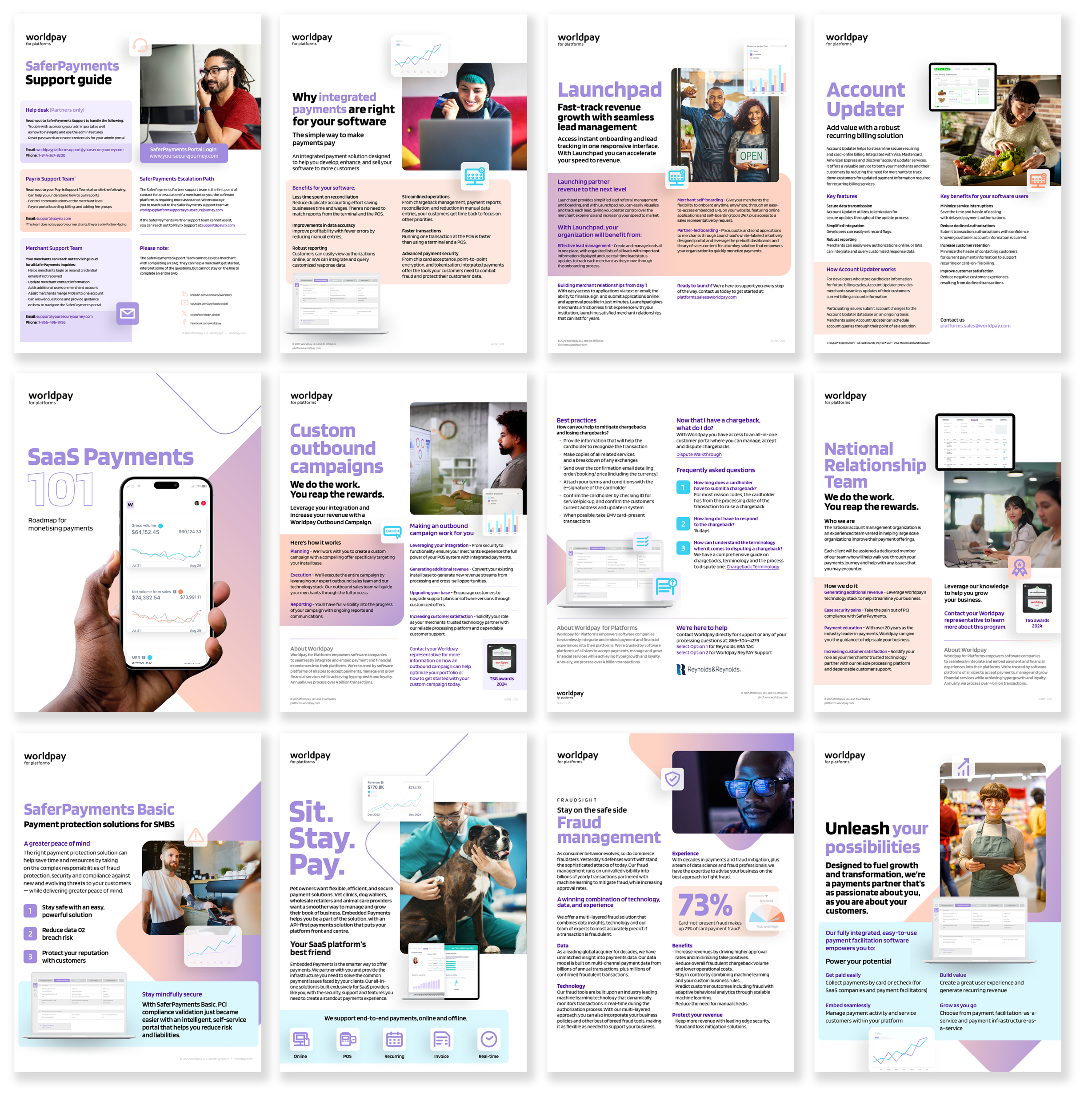
Product marketing toolkit
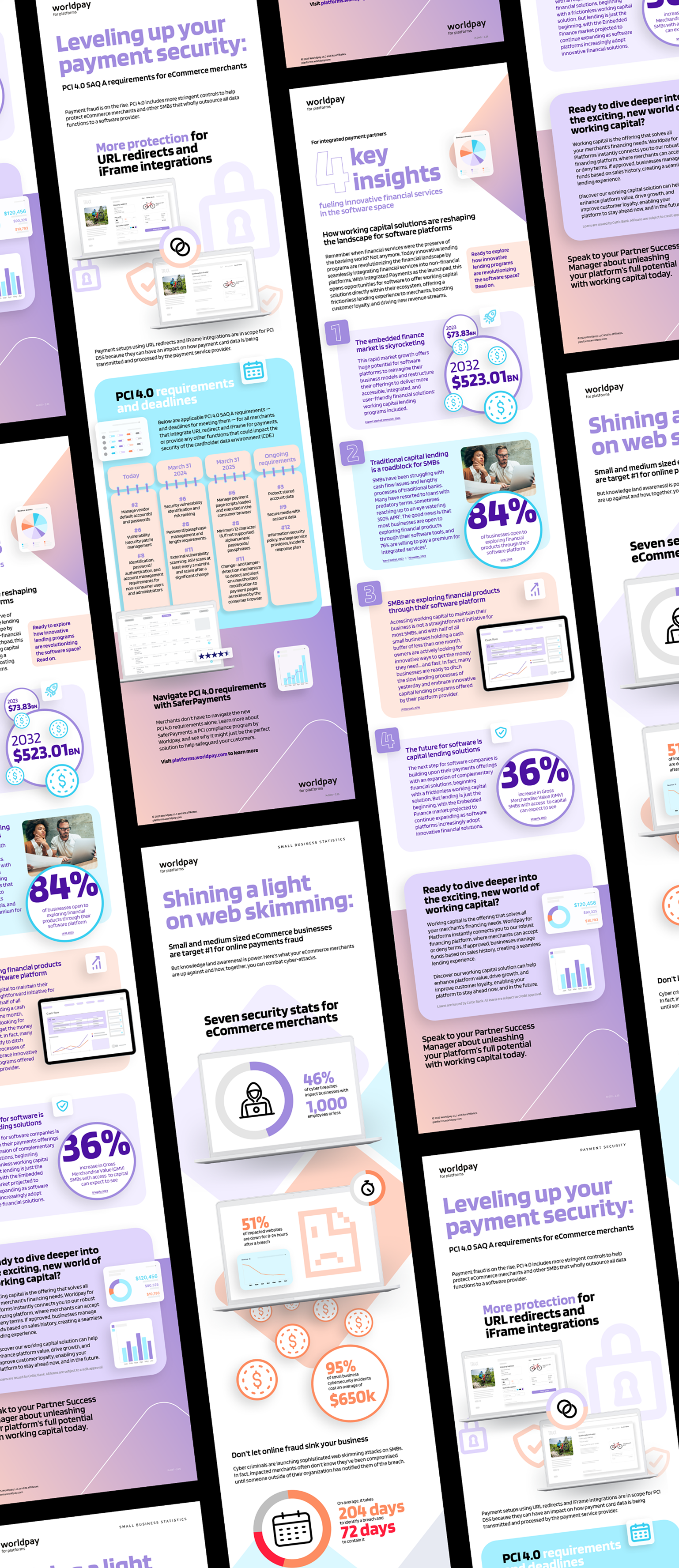
Infographics