GKN and Fokker merger branding
GF Aerospace

Shaping the fiuture of flight
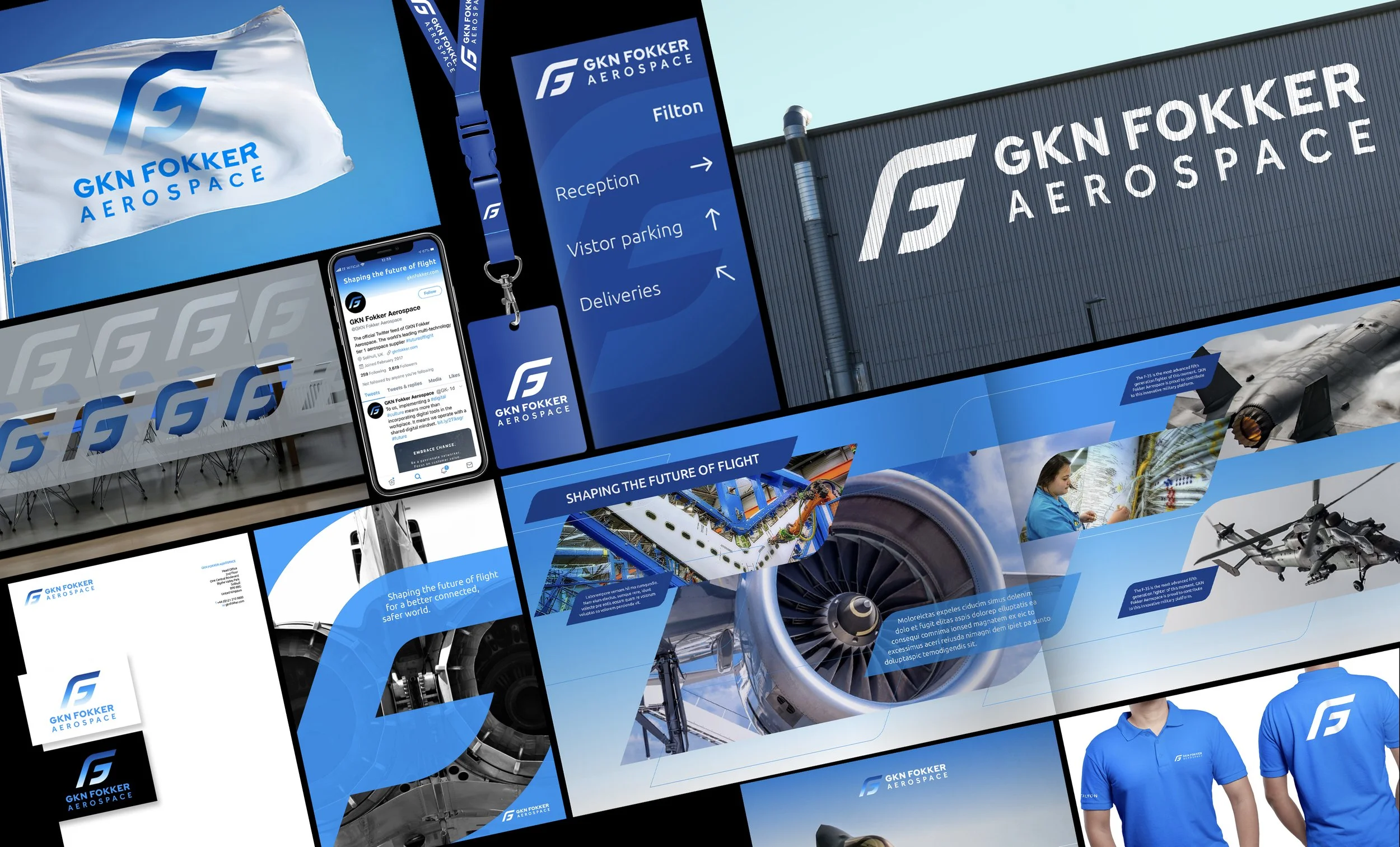
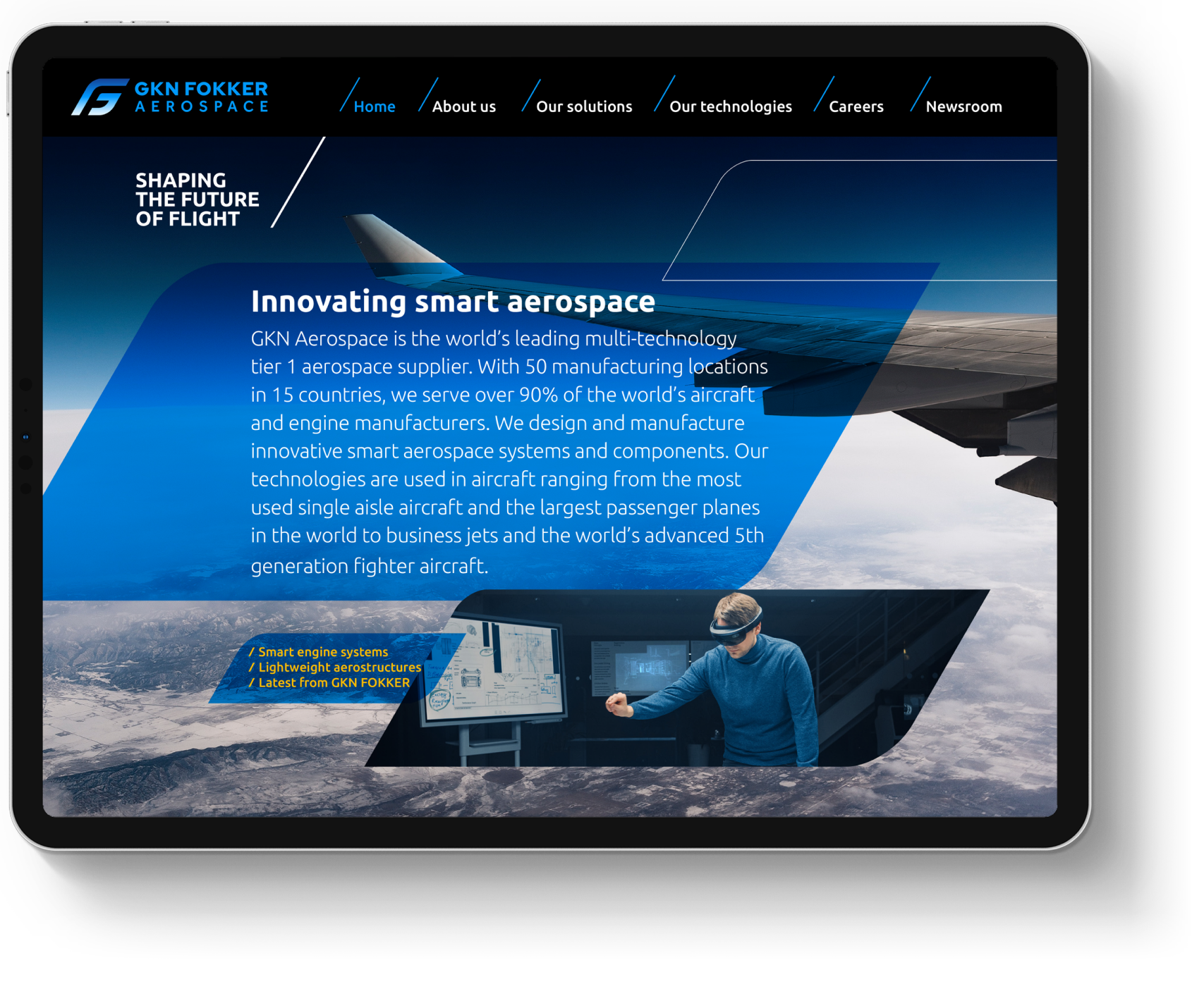
Merging GKN Aerospace and Fokker required more than just a name change; it demanded a visual synthesis of British engineering and Dutch aviation heritage. The goal was to create a "Global Aerospace powerhouse" brand that felt seamless across everything from digital interfaces to physical signage globally.
Lots of research and workshops entailed a huge change. The centrepiece of the rebranding is the GF monogram.
The monogram draws its form from aerospace engineering, mimicking the sweep of a wing and the curve of a turbine. By nesting the ‘F’ within the negative space of the ‘G’ and applying a sky gradient, capturing the synergy of the two brands in one cohesive mark.
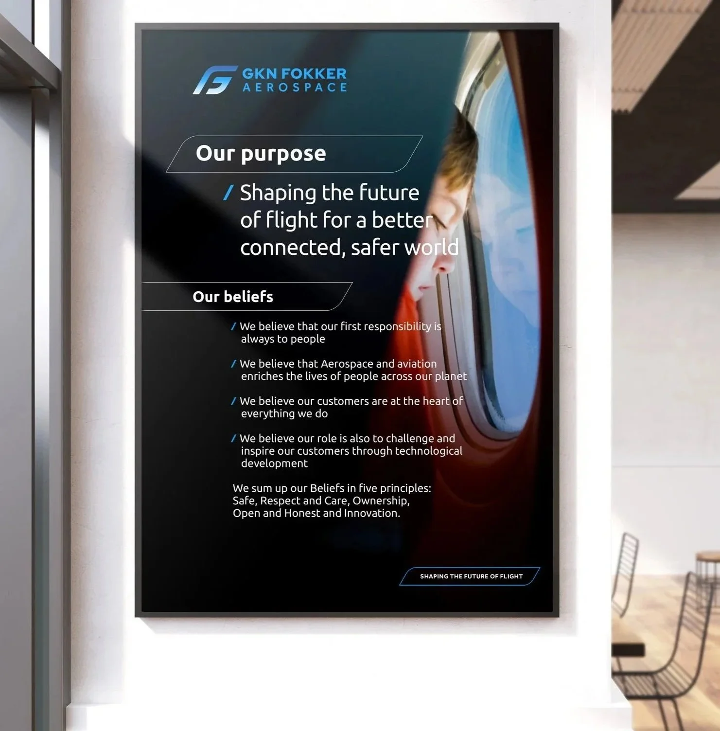
The brand was stress-tested across a diverse range of high-visibility applications to ensure global consistency across 70 global sites. Its application included guidelines, digital presentations, website, and exhibition environments to factory floors and branded hardware, the brand culture is felt on the ground as much as in the air.
Brand in action
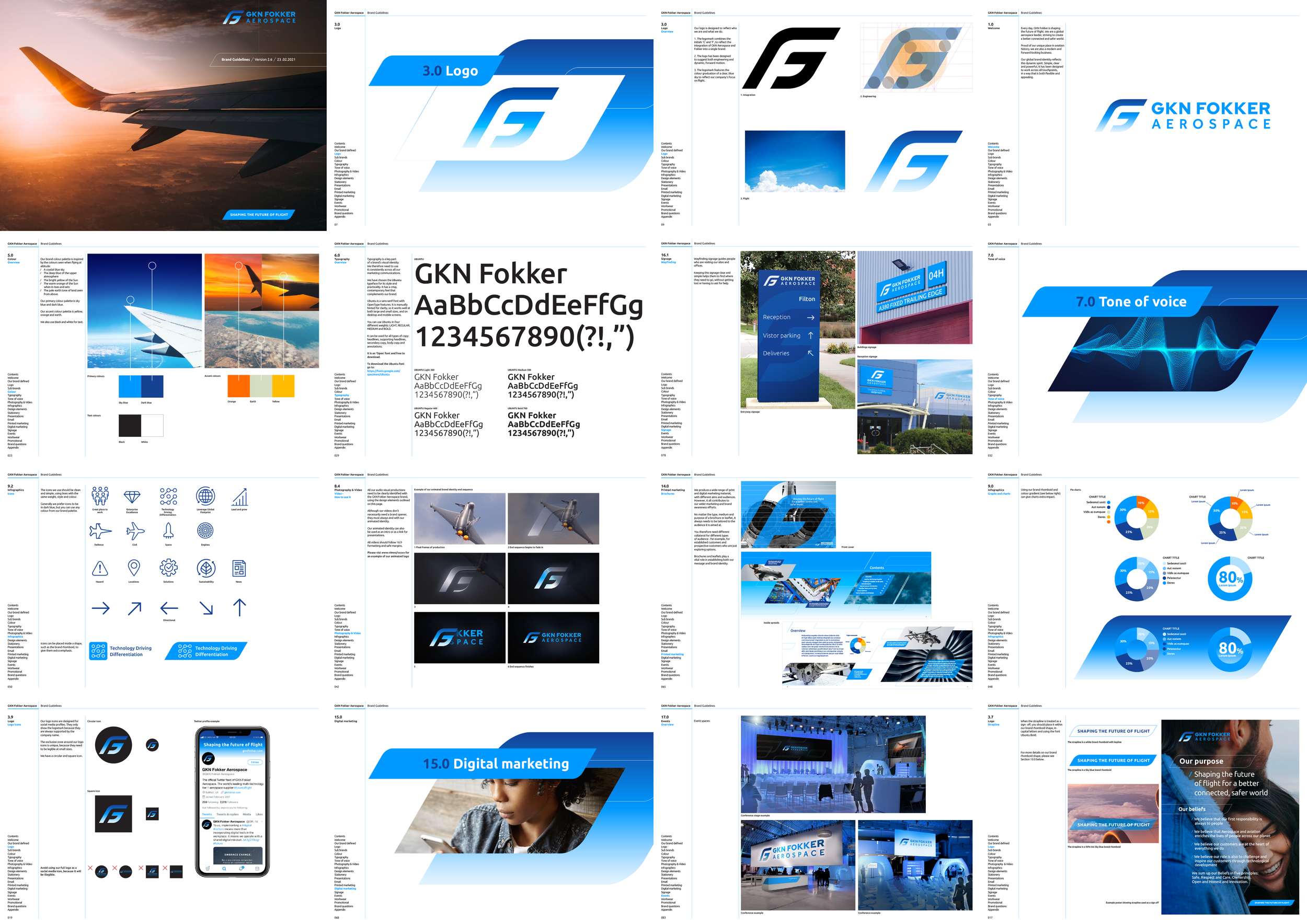
Guidelines